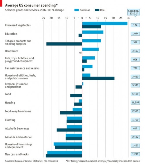
The Economist posted a graph, based on Bureau of Labor Statistics data, that shows how U.S. consumer spending changed between 2007 and 2010. The results provide a good snapshot of the economic trade-offs Americans are making (i.e., we’re buying more canned veggies and eating out less), as well as which industries are taking the biggest hit as consumers redefine their products as less essential.
 The “nominal” numbers refer to the unadjusted overall changes in spending; the “real” numbers are adjusted for the fact that prices rose by about 5.2% on average, so consumers are getting less for what they spend. So the light blue bars tell you the absolute change in what we’re spending; the dark blue bars, the change in spending relative to how much we’re buying. When adjusted for price inflation, consumer spending fell by about 8%: