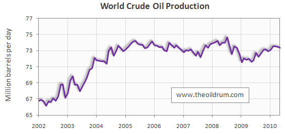
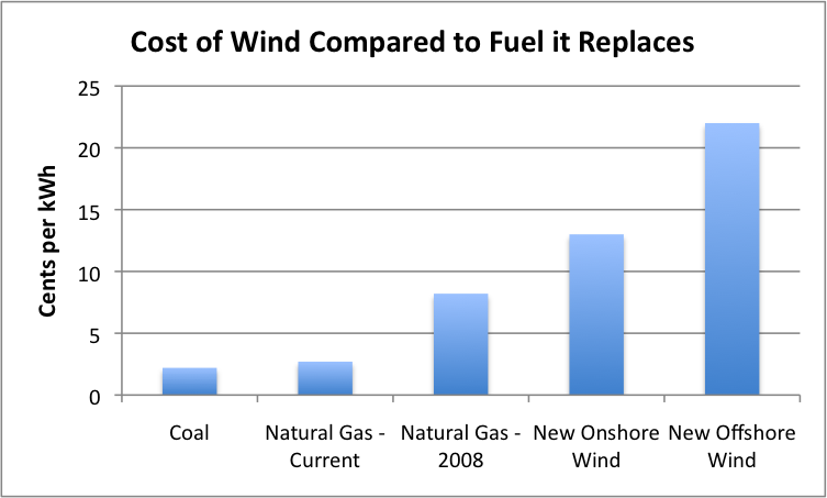
From TheOilDrum (TOD) A picture says a thousand words. In this post you will find only charts and graphs conveying important points from the world of energy 2010.
Readers are invited to post their favorite charts from 2010 in the comments. Instructions are given at the end of this post. This is a charts only thread, no text at all (though posting links is OK),
Below are my favs see more at TheOilDrum
Below are my favs see more at TheOilDrum


