It gets worse... "The cumulative releases from Fukushima of iodine-131 and cesium-137 have reached 73% and 60% respectively of the amounts released from the 1986 Chernobyl accident. These numbers were reached independently from a monitoring station in Sacramento, CA, and Takasaki, Japan. The iodine and cesium releases are due to the cooking off of the more volatile elements in damaged fuel rods." - SlashDot
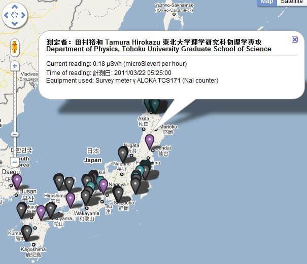
One of the best of the new radiation maps was developed by Portland’s Uncorked Studios. In only 72 hours they created RDTN.org, an online display of up to date radiation levels across Japan and neighboring regions. Their information is gathered from volunteer and official sources and embedded onto an adapted Google Map. Three days from concept to a working map that gives valuable and reliable data to anyone who wants it for free, and not a dollar was spent in its production. Amazing.
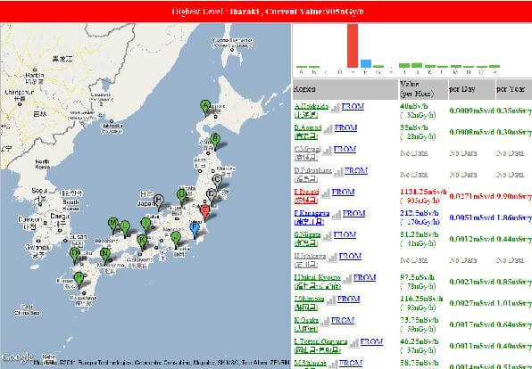
Another great map of radiation levels was created by South Korean firm ISELSoft using their STUBBY web bots. The Stubby map compiles data from the web, gathering readings from various monitors across Japan, Korea, and Central Asia. It also color codes the data to reflect hazard levels. While it doesn’t have as many data points as RDTN, it is clear, easy to read, and regularly updated. Another winner.
While many of those wanting to track radiation levels after the Fukushima accident do so out of sympathy for Japanese citizens, let’s not ignore the fact that many others are simply worried about when dangerous radiation levels could show up in their own backyard. Along with maps detailing Japan, there are also a few looking elsewhere on the globe. The best example was created by Mineralab, producers of Geiger counters and related supplies. Their Radiation Network map shows radiation levels reported from individual monitors across the US. It also marks the location of nuclear facilities. The map is updated every minute, giving you radiation readings almost in realtime.
There are several reasons why RDTN and the Stubby map are superior in my mind to the Radiation Network: They include a large amount of data from a number of reputable sources, they focus on the area most concerned with the accident, and the quality of their images seems better. Radiation Network, however, may give us a better idea of what we can expect in the future. While the first two maps are specifically geared towards the Fukushima Nuclear Power Plant crisis, the latter is taking a much broader scope.


